「カリグラフィーペン・2つのニブを試した結果!」Calligraphy Pen/Review of 2 nibs
![]()
【English Below】
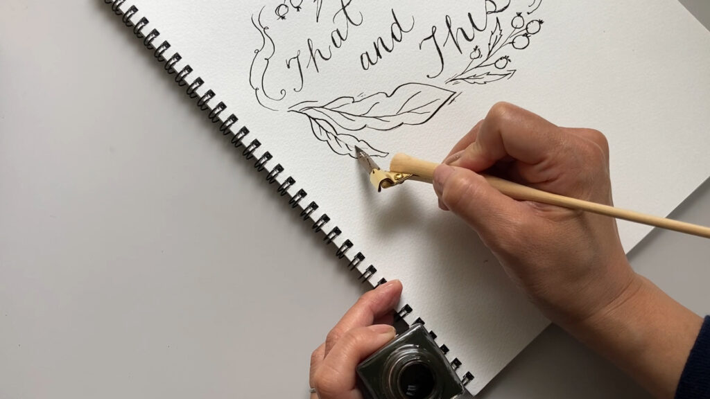
前々から大好きだったカリグラフィーペン!YouTubeでも話しましたが、学生の頃に買ったカリグラフィーホルダーとニブは持っていました。でも大して使いこなさないまま、ずっと引き出しで眠ったまま。久しぶりに引っ張り出してきて使い始めたのです。今ならいろんなホルダーがあるのだろうと思ったのが最後!ネットで調べ始めたら止まらない止まらない!(苦笑)可愛いのがあっちこっちでたくさん売られてるじゃんね!
ということで、散々悩んだ末、新しいものをお迎えして絵を描いてみました!衝動買いしちゃったかわいいニブと、合わせて2種類のニブを試した結果、使用感に違いがあったので、レビューしてみたのです!
ニブのチェックポイント
しなやかさ
カリグラフィーのニブは先端が二股に分かれていて
ニブに筆圧を多く書けるとその股が開いて流れてくるインクの量を増やすというシステムでラインの太さを出すことができます。筆圧をかけた時に、しなりが柔らかいとより圧がかかり、しなりが硬い場合は圧がかかりにく感じでした。
■筆圧が高いとより太い線。(もしくは、細いラインと太いラインのコントラストが高くなる。)
■筆圧が低いと細い線。(もしくは、細いラインと太いラインのコントラストが低くなる。)
インクの持ち
一度のインク付け足しでより長く書けるのはシルバーカラーのニブでした。これは、ニブの構造のどの部分が左右することなのかは、私にはわかりません。でも、ニブの裏の窪みが深いとより多くのインクが乗るのではないかと私は思ってます。インクの持ちが良いと、何度もインクをつける作業が減るので、その分時短であり、手間も少ないとも思います。
紙への引っ掛かり具合
ブラウンのニブは、紙の上での引っ掛かりが強めで、「カリカリ」と音がします。
逆に、シルバーカラーのニブは、紙への引っ掛かりもさほどかったです。その分、スイスイと滑るように髪の上を動く感覚がありました。
先端までのリーチの長さ
持った人の手の大きさによっても使用感はきっと変わると思いますが、リーチが長いものと短いもの、力を加えた時のバランスの取りやすさ、圧をかけた時(太いラインをかく時)の太さ加減などに影響があると思っています!
先端の鋭さ
先端が針のように尖っているとより細い繊細なラインが書けると思います。
カリグラフィーはほとんど経験もなく、見よう見まねでただただ楽しいからやっているという程度の自分が、
実際使ってみた感想をシェアしています。
基本的にプロのお話ではなく、むしろ素人が使ってみた感想だと思ってくださいね!
そんな私が個人的に感じた使用感の違いをまとめておきますね!是非参考にしてみてね!
いつも読んでくれてありがと!
またね!
【English】
Calligraphy has been always something interesting for years. I had bought some holders and nibs in my teenage years, but they had slept in my drawer for long time until now. However, the idea to use them for my illustration has gotten my attention this year! Then I started searching what more holders and nibs out in the market now! I couldn’t stop looking at them because I now knew more possibilities to get so many beautiful holders!! I had spent some days not being able to decide which one to get! In the new YouTube video, I share my new holder and nibs, how I felt about 2 different nibs, and my actual illustration by using those nibs!
Check Points for Nibs:
-Softness-
■More pressure to nib, bolder line you write.
■Less pressure to nib, thiner line you write.
-Amount of ink it holds-
I felt…
The silver nib that I used in my video holder could drew longer after one dip. It could be explained it held more amount of ink…I think the pocket of the silver nib’s back seems deeper than the brown one’s, so the amount of ink they hold in one dip can be the reason! More ink it holds, less movement and time.
-Scratchiness against paper-
The brown nib that I used in my video was more scratchy than the silver one. I felt the silver nib was easier for beginner with more smooth movement for illustration and writing.
-The length to pen point-
I thought that the length to the pen point might influence to comfortless and smoothness of writing, and the boldness of lines written. The size of writer’s hands could be another influence, too.
-The pointedness of nibs-
More pointed nibs, thinner lines, I think!
I am self-taught artist of any medias that I do. And calligraphy is included. I’ve never taken any calligraphy courses before and haven’t practiced that much! So, my review for 2 different nibs are voices of someone who is an amateur.
I hope my review will help somebody who plans the first try for calligraphy, or researches which holders and nibs to get! I summarize some points that I came up with after I actually used them!
Thank you always, to stop by and read until the end!
Have a good good day!
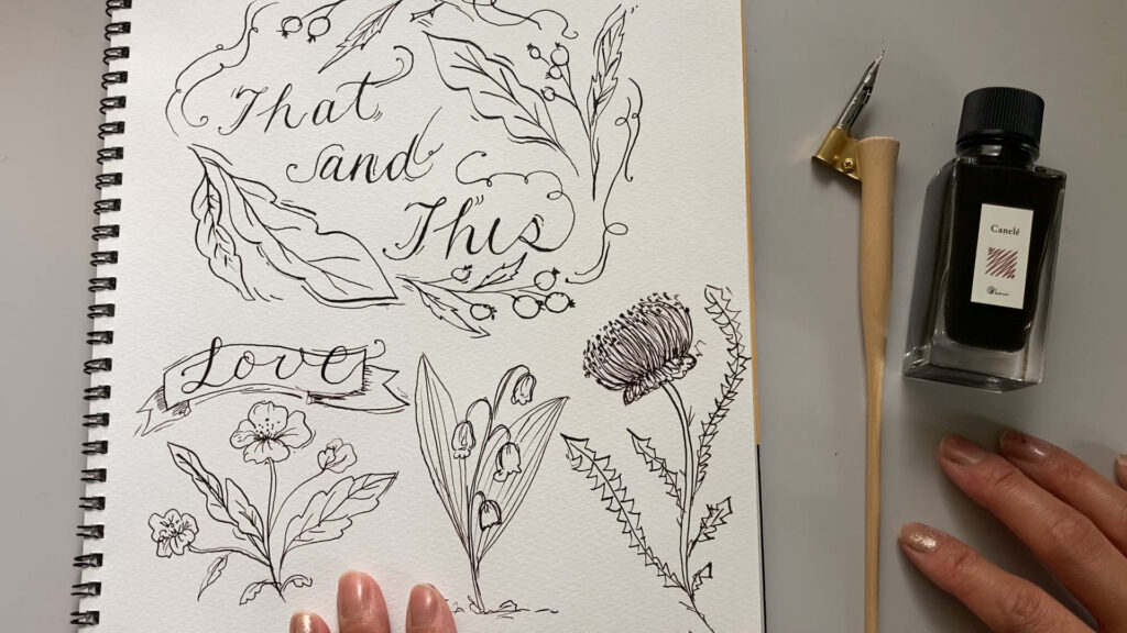
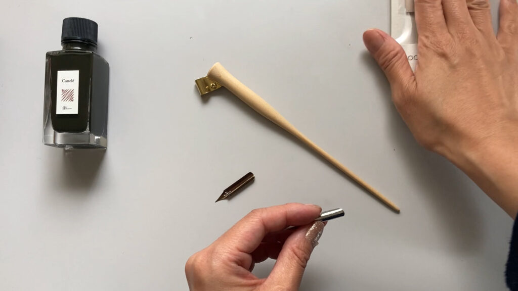
INK
■ Kamimori https://kakimori.com/
Blend Ink/Canele(ブレンドインク・カヌレ)
https://kakimori.com/collections/k17kbk/products/k17kbk33cn
HOLDER
■ Paper Tree https://www.papertree.jp/
Holders: https://www.papertree.jp/SHOP/178962/196196/list.html
The same holder has been removed from the shop, but you can see many of different ones.
この動画に登場するフォルダーは、すでにショップに存在しませんが、
他にも違うデザインのフォルダーがたくさんありますのでチェックしてみてね!
NIBS
https://www.papertree.jp/SHOP/178962/196183/list.html
The brown nib: https://www.papertree.jp/SHOP/CA-NI-17.html
The silver nib: https://www.papertree.jp/SHOP/CA-NI-36.html