【STORY】ロゴのお話 ー第2話ー/The Logo -the 2st story-
ロゴのお話ー第2話ーです。
Hello, everyone.
This is the logo story, part 2 today.
もっと「バタバタでも常に動いている」という部分を表現したくて、
1文字ずつサイズを違えて、左から右へだんだん大きくすることで
動きを出したもの。
Expressing movements of "working busy"
by putting smaller alphabets to bigger ones from left to right.
いやいや、動く方向って1方向じゃなく、このときはあっち向いて、
あのときはこっち向いてるなーと思い、
文字の大きさではなく角度をバラバラにしたもの。
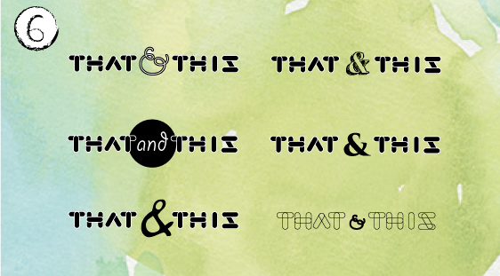
「and」の部分をおもしろいフォントにして配置、「遊び心」を表現した。
Well movements of That & This aren't in one single direction.
Instead, putting each alphabets in different directions.
Unique typeface of "&" adds an essence of "playfulness."
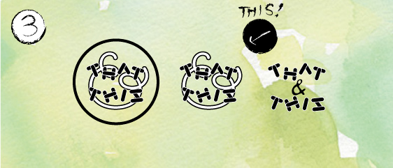
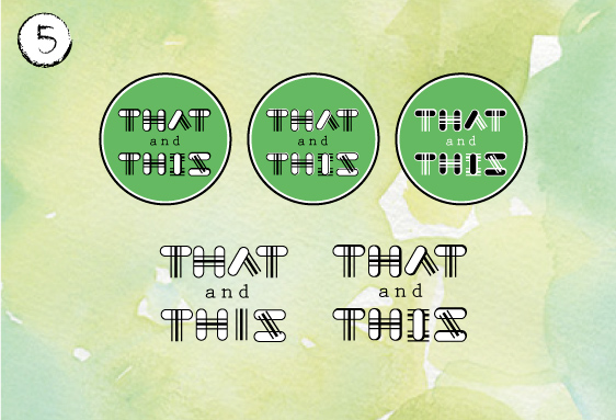
①のように四角にいれられるのって違う!ならば○だ!と○に入れたもの。
これ、ステッカーなどをつくるときにイメージし易い。
「遊び心」はフォントで十分表現できているように思ったので、
「and」の部分を読み易く読み易いようにした。
簡単な説明だけだけど、こんな感じに進んでいきます!
Putting the shop's name in a circle shape instead of a square,
to remove corners, and put "and" instead of "&" for readability.
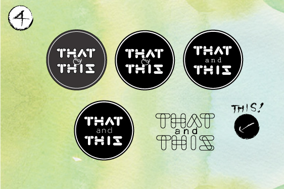
フォントに使った図形を違うものと組み合わせたほうが、
「あれこれ」を表現できるかなぁと思って、一部を3本ラインにしたもの。
Creating 3 lines in fonts to express more "that & this".
「THAT」と「THIS」を横並びにしたもの。
「and」の配置でどれだけ違うデザイン起こせるか、と実験したもの。
ということで、他にも色々デザインしましたが、
第1段階でしぼられたものだけ載せてみました。
こうやってまとめてみると、楽しかったなと再確認!
何かを生むという作業が愛おしいです!
さて、ここからどうロゴがしぼられたか、最終話に続きます!
Putting "that" and "this" horizontally.
Tried figuring out how much difference could make only by changing "and" designs.
Thus, many more logos were created.
As I summarize the processes of the logo design, I recognize how fun it is!
More love of the creation!
The final decision will be coming up next!
Bye, for now!